
Hey guys, am REALLY sorry about missing the second pitch today. Spent most of my day crouched over the toilet trying to stop my stomach escaping through my mouth.
Got a brief text from Sarah saying it went well so nice one!!! Awaiting the more detailed report that will no doubt be turning up on Sarah's blog over the next couple of days. Now the preps pretty much there we can storm on with the production.
Again really sorry for missing the pitch.
Matt
Monday, 23 November 2009
Friday, 20 November 2009


Colour Scrpits
Im just gonna chuck these up as i complete them. I'm gonna need feedback as soon as possible so i can make the changes.
Right number 1

Right number 1

Sunday, 15 November 2009
Xtremly Rough
Right i know the timings off really quite badly in some places, but ive tried to time it with the actions of the characters laid out in my head. Looking back at it in some places it seems to hold for too long and in others not enough, but to me it still feels rushed. I know this is because ive tried to do it to the 1 minute deadline and doing it in this way to me feels really wrong, given the strength of the story i feel we should be letting it time itself rather than plugging it with a limit, which is why i would like us to do a film test, its quick, easy and will give us a much clearer example of the timing than guessing at it with the rough thumbnails we have.
Saturday, 7 November 2009
Macho
Got him laid out this afternoon.

One of Sarahs character poses.
This was the colouring selected for Macho from my earlier test applied to the newer design. The body works fine but since loosing the stripes the arms (to me)look kinda bare, but then im not sure whether the stripes will suit the newer design. Will see what the feedback is on this and get the other two charcters laid out before i go back to make any changes though.
Note: I've also started documenting the Hue/Saturation details when colourising the textures. If ure doing any colour work i advise you do the same - if you decide to reuse a colour you can get it exactly the same.
Wednesday, 4 November 2009
Now we're getting somewhere.
Righty spoke to Sarah about the textures i done on the watering can, and it apparently it was kind of the basis of what she wanted...but somewhere along the line it had fallen apart. I was given a different model to apply the textures to and told me to go away and look at this picture of the front door from Pixars up. So i decided the best way to get a grips with this look was to try and replicate it.

Ands heres the result(below), it must have taken me about 30 mins to do and i only used sourced imagery i found on the internet. Considering it was only a rough test i think it came out pretty well.

Taking this test i then tried adapting the texture using the base process i had been using on my previous texture tests. So we basically loose the the wood grain and replace it with two layers of watercolour effects, one layer is a scan of a watercolour paint spill and the second is watercolour photoshop brushes set on overlay.

I then took this texture and changer the colour of the watercolour spill to blue and added a layer of light grey underlay and applied it to the model. You have to add a occlusion render because the watercolour texture doesn't react to the lighting to well and come out quite dull from a straight render. Showed this to Sarah and she seemed to really like it, so yeh, need some more experimentation with bump mapping and different render passes but i'd say we're nearly there.

Am going to leave the texturing alone for a little while now and work on the story, we spoke about it at length for quite a while yesterday and i think we've got it working again with a new beginning, i've just gotta get it all thumbnailed which is a really boring job.
Sunday, 1 November 2009

Umming and Arrring
Hmmmm....
Phong E
Lambert

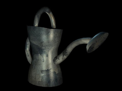
Im not sure whether its just the crudeness of the model or the lack of surrounding enviroment but i still have the nagging feeling that its missing something. Rough watering can based on some of Sarahs sketches, coloured using the same technique as the final leaf and without any burns.
I havn't done anything additional to the levels but there is much more colour contrast, i think thua didnt appear so much in the leaf because it was a large texture on a small object and the burn covered too much up.
Out of these two i think i prefer the Phong (which is what the leaves were and why they were so reflective) The light playing of it seems to add another level of depth, but to be honest i think the material is something that should be dependant on what the object is.
Phong E

Lambert

Im not sure whether its just the crudeness of the model or the lack of surrounding enviroment but i still have the nagging feeling that its missing something. Rough watering can based on some of Sarahs sketches, coloured using the same technique as the final leaf and without any burns.
I havn't done anything additional to the levels but there is much more colour contrast, i think thua didnt appear so much in the leaf because it was a large texture on a small object and the burn covered too much up.
Out of these two i think i prefer the Phong (which is what the leaves were and why they were so reflective) The light playing of it seems to add another level of depth, but to be honest i think the material is something that should be dependant on what the object is.
Subscribe to:
Posts (Atom)
