Sunday 13 December 2009

More Tests

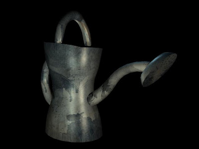
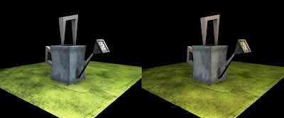
Right first things first, i had a play with the lighting. Was looking at the test i did the other day and its horribly sterile lighting, so i looked at some autumny stuff and coloured and toned down the lighting to give it a more autumn feel. Theres now orange, green and yellow lighting the scene and i had to add a faint blue because the blue of the watering can got washed out. I wanna make the scene a tiny bit more foggy in some places so that we get some light trails but I've got nowhere near enough stuff to see how thats gonna work yet. The picture above is the same image the only thing different is the lighting colours/levels.
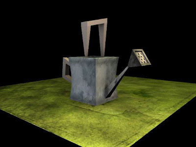
Same as the pic above, just felt the need to shown it standing alone. Ive upped the bump a bit from the last test. (this is my favorite test)
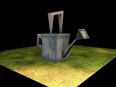
Just trying to see what its gonna look like with patches of dirt on it. This is only a quick test and isnt really that good and to get it working well in this way is going to take alot of effort and make the floor possible too busy once all the other objects are placed in the scene. I can always do more tests like this if necessary.
This was just the dirt texture i got overlayed ontop of the prexisiting texture, which i thought looked quite interesting.
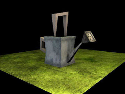
So i changed the colour of it to make it less yellow and more green. This still work and looks more rugged, but i think may draw too much attention to itself and stands out more than the watering can.

Thoughts Plz...

Friday 11 December 2009

Grass

Had a play with the flat plane grass and just want some feedback on this test cause i quite like it. This isn't done with the velvet but by mixing the existing textures with a cloud overlay and then a diffusion cloud bump. The lighting is a tad too bright in the first example because i underestimated the power of the occlusion but see what you think.

Was this our final model for the watering can? cause if it was i'll start texturing it properly.
And the close up, this is about an 2 inchs from the plane and has no occlusion on it. Theres a graphic pen overlay which is causing some trouble on the lighter areas but this is only because the size of the texure isnt massive and can be easily fixed. Let me know what you think cuz i want to see if i can get some longer grass incorporated in some areas (in the background round the watering can).

Monday 23 November 2009

Mr Messenger is Unwell

Hey guys, am REALLY sorry about missing the second pitch today. Spent most of my day crouched over the toilet trying to stop my stomach escaping through my mouth.

Got a brief text from Sarah saying it went well so nice one!!! Awaiting the more detailed report that will no doubt be turning up on Sarah's blog over the next couple of days. Now the preps pretty much there we can storm on with the production.

Again really sorry for missing the pitch.

Matt

Friday 20 November 2009

3

2

Colour Scrpits

Im just gonna chuck these up as i complete them. I'm gonna need feedback as soon as possible so i can make the changes.

Right number 1

Sunday 15 November 2009

Xtremly Rough


Right i know the timings off really quite badly in some places, but ive tried to time it with the actions of the characters laid out in my head. Looking back at it in some places it seems to hold for too long and in others not enough, but to me it still feels rushed. I know this is because ive tried to do it to the 1 minute deadline and doing it in this way to me feels really wrong, given the strength of the story i feel we should be letting it time itself rather than plugging it with a limit, which is why i would like us to do a film test, its quick, easy and will give us a much clearer example of the timing than guessing at it with the rough thumbnails we have.

Saturday 7 November 2009

Macho

Got him laid out this afternoon.

One of Sarahs character poses.
This was the colouring selected for Macho from my earlier test applied to the newer design. The body works fine but since loosing the stripes the arms (to me)look kinda bare, but then im not sure whether the stripes will suit the newer design. Will see what the feedback is on this and get the other two charcters laid out before i go back to make any changes though.

Note: I've also started documenting the Hue/Saturation details when colourising the textures. If ure doing any colour work i advise you do the same - if you decide to reuse a colour you can get it exactly the same.

Wednesday 4 November 2009

Now we're getting somewhere.

Righty spoke to Sarah about the textures i done on the watering can, and it apparently it was kind of the basis of what she wanted...but somewhere along the line it had fallen apart. I was given a different model to apply the textures to and told me to go away and look at this picture of the front door from Pixars up. So i decided the best way to get a grips with this look was to try and replicate it.

Ands heres the result(below), it must have taken me about 30 mins to do and i only used sourced imagery i found on the internet. Considering it was only a rough test i think it came out pretty well.

Taking this test i then tried adapting the texture using the base process i had been using on my previous texture tests. So we basically loose the the wood grain and replace it with two layers of watercolour effects, one layer is a scan of a watercolour paint spill and the second is watercolour photoshop brushes set on overlay.

I then took this texture and changer the colour of the watercolour spill to blue and added a layer of light grey underlay and applied it to the model. You have to add a occlusion render because the watercolour texture doesn't react to the lighting to well and come out quite dull from a straight render. Showed this to Sarah and she seemed to really like it, so yeh, need some more experimentation with bump mapping and different render passes but i'd say we're nearly there.

Am going to leave the texturing alone for a little while now and work on the story, we spoke about it at length for quite a while yesterday and i think we've got it working again with a new beginning, i've just gotta get it all thumbnailed which is a really boring job.

Sunday 1 November 2009

Pen Scratches Added

Something more akin to this you mean?

Umming and Arrring

Hmmmm....

Phong E

Lambert

Im not sure whether its just the crudeness of the model or the lack of surrounding enviroment but i still have the nagging feeling that its missing something. Rough watering can based on some of Sarahs sketches, coloured using the same technique as the final leaf and without any burns.
I havn't done anything additional to the levels but there is much more colour contrast, i think thua didnt appear so much in the leaf because it was a large texture on a small object and the burn covered too much up.
Out of these two i think i prefer the Phong (which is what the leaves were and why they were so reflective) The light playing of it seems to add another level of depth, but to be honest i think the material is something that should be dependant on what the object is.

Thursday 29 October 2009

Textuuuuuurrrrrrrres.

Right few more tests trying to get somewhere. This is the first tests i've done where ive used a proper 3 point lighting setup.

This is just an old paper texture with the levels thrown right up and an overlay colour. Too acid green and there isnt enough interesting variation in the texture.
Old wall texture same process as before. Not really too keen on this.
This is a downloaded watercolour photoshop brush that i've layered then overlayed the colour. Also drawn on it a little bit to add some definition to the shape. Aside from the colour being too vibrant i think its still missing something.
Right for this one ive taken one of the watercolour example textures Sarah had on her blog and i've done a colour burn a really light single brush splash and drawn ontop with the swirley veins (thinking of the paper examples Adam showed the other day) Its still to plain and the swirley veins are really stark and stand out too much.
Pretty much the same as above but i've played with the opacity of the layers and the colours/lighting.
Right this is again similar to the one above but more developed. Ive added another layer using the photoshop brushes and played some more with the levels. I quite like this one, will try the same process on some other objects and see what it looks like.

Monday 26 October 2009

ColourTests

Right so its been decided that we are going to be ussing some different character designs that have been done by Sarah. I like the design for Hero but think that Macho and Girl need more development because Macho doesnt really have the build i think is necessary to portray a really physically stong charcater and Girl is a bit too plain and needs something to make her more identifiable as a female.
I'm going to be focusing mainly on texuring, colouring and lighting over the next couple of days as well as working on the thumbnails ive been designated.
Right my favorite of Hero colours is either the red or the blue. The origional colouring was done in the green but Sarah says its too vibrant.On Macho i like the Black, Brown or Blue.
And on Girl i like the purple, orange or blue, but seeing as she may still chage quite a bit this may change.

Thursday 22 October 2009

Screenplay Take 2

Righty shown the new screenplay and she likes it (yay) and then spoke about it to Dan Dahli whilst in the pursuit of drawing pins and he likes it (more yay). So as the story its going ahead with one small difference, we had been umming and arring about having Girl as a statue or real life and i wrote her into screenplay 2 as a statue, and Sarah finally decided that she should be moveable like the two boys. So i've done a quick rewrite and its been given the thumbs up to go to thumbnailing. I've pretty much taken the last one and added actions and reactions from Girl gnome.

A football bounces across the screen and in front of some reeds and disappears off to the side. The reeds shift slightly and hero steps out from between the looking tired having just woken up. Stretching he lets out a big yawn and looks across the pond lovingly at Girl gnome who is sitting combing her hair upon a pile of stones haloed by the morning light and small butterflies.
Hero plucks a Daffodil from a nearby flowerbed, smartens himself up and starts making his way over to her.
As he gets closer the sound of someone counting off reaches his ears and he slows, peering round a large leaf he sees Macho stretching infront of Girl. Macho looks over his shoulder to make sure she is watching, then reaches down and picks up a nearby rock and starts bench pressing with it. Girl is sat hugging her knees looking politely interested. Hero ducks back behind his leaf and ponders for a second before getting an idea.

Macho is happily bench pressing his rock, showing off, when Hero sidles up next to him looking intrigued. Macho although distracted does his best to ignore Hero. Hero makes a noise of disinterest and wanders off to the side. Girl straightens up and pays more attention. Macho annoyed at having his weight lifting dismissed so lightly sets the rock down and picks up a bigger one and starts lifting that. Hero walks back and makes a noise of mild surprise before walking off again, Macho is aghast at having his efforts once again put down by Hero so sets the bigger rocks down and picks up a garden fork and starts lifting that, struggling under the weight a little but achieving it.

Girl is seemingly impressed at what she’s looking at “oohs” softly under her breath. Macho hears and is ecstatic at getting a reaction from her and looks to see if Girl is looking and distraught to see she is infact interested in Hero balancing a stick on the end of his hand.

Macho throws the fork down and looks around desperately for something bigger to lift. He settles on a large flower pot with a large sunflower in it. He gets his fingers under the edge and starts lifting slowly putting all of his strength into it. Slowly it starts to raise then lifts faster and faster until he has the whole thing above his head. Gasping for breath Macho lets out a little laugh of exhilaration and looks across at Hero and Girl.

Hero and Girl are amazed and wander closer staring in bewonderment at the large weight perched on Macho’s shoulder, before Hero smiles coyly. He reaches down and picks up a small pebble off the ground, biting his tongue he concentrates and throws the stone which lands ontop of the flowerpot.

Unable to handle the added (although small) weight Macho’s shoulders start shaking before he falls to one knee. Then with an almighty crash the Flowerpot falls to the ground, Macho disappearing underneath it.

Girl stares at the spectacle infront of her before bursting out laughing at Machos embarrassment. Hero pleased to have gotten rid of the competition happily twirls Girl around. Placing her down on the other side to where she’d been standing they stop look into each others eyes and slowly lean in to kiss. Suddenly the football flies onto screen and smashes Girl into hundreds of pieces.CreditsMacho lifts the flowerpot off the ground and crawls out from underneath it, resting on the grass out of breath he looks up to see Hero (glue in hand) proudly looking over a badly remade Girl. Hero leans in for a kiss and a part falls off her.


Just reading back over it there are several areas that aren't perfect yet, but i imagine it will all come together in storyboarding and probably change quite alot, so we'll wait and see how it pans out.

Screenplay

Was brainstorming yesterday trying to incorporate all the story plots that have to be input in the film. Namely brains over brawn, and that Machos downfall should come about by his own hand and he should become trapped or embarrised but remain unbroken.
Then for some reason i got the introduction of the Amazing Bobinski in Coraline, where you see him stretching out ontop of the house (laus, ouva, trey, getil!) And i just wanted to get Macho somewhere in the film doing something similar. That spawned the idea of Macho working out infront of her and i knocked out this new screenplay in about 20 mins.

A football bounces across the screen and in front of some reeds and disappears off to the side. The reeds shift slightly and hero steps out from between the looking tired having just woken up. Stretching he lets out a big yawn and looks across the pond lovingly at Girl gnome who is stood upon a pile of stones haloed by the morning light.
Hero plucks a Daffodil from a nearby flowerbed, smartens himself up and starts making his way over to her.
As he gets closer the sound of someone counting off reaches his ears and he slows, peering round a large leaf he sees Macho stretching infront of Girl. Macho looks over his shoulder to make sure she is looking(which she obviously is because she can’t move), then reaches down and picks up a nearby rock and starts bench pressing with it. Hero ducks back behind his leaf and ponders for a second before getting an idea.

Macho is happily bench pressing his rock, showing off, when Hero sidles up next to him looking intrigued. Macho although distracted does his best to ignore Hero. Hero makes a noise of disinterest and wanders off to the side. Macho annoyed at having his weight lifting dismissed so lightly sets the rock down and picks up a bigger one and starts lifting that. Hero walks back and makes a noise of mild surprise before walking off again, Macho is aghast at having his efforts once again put down by Hero so sets the bigger rocks down and picks up a garden fork and starts lifting that, struggling under the weight a little but achieving it. Macho looks to see if girl is looking and see’s Hero leaning against her nonchantly watching him. Hero looks at Macho the at Girl then back at Macho then shakes his head.

Macho throws the fork down and looks around desperately for something bigger to lift. He settles on a large flower pot with a large sunflower in it. He gets his fingers under the edge and starts lifting slowly putting all of his strength into it. Slowly it starts to raise then lifts faster and faster until he has the whole thing above his head. Gasping for breath Macho lets out a little laugh of exhilaration and looks across at Hero and Girl.

Hero seems impressed and wanders closer staring up at the large weight perched on Macho’s shoulders, before Hero smiles coyly. He reaches down and picks up a small pebble off the ground, biting his tongue he concentrates and throws the stone which lands ontop of the flowerpot.

Unable to handle the added (although small) weight Macho’s shoulders start shaking before he falls to one knee. Then with an almighty crash the Flowerpot falls to the ground, Macho disappearing underneath it.

Hero pleased to have gotten rid of the competition happily skips up to Girl. He closes his eyes and slowly leans in to claim his kiss. Suddenly the football flies onto screen and smashes Girl into hundreds of pieces.CreditsMacho lifts the flowerpot off the ground and crawls out from underneath it, resting on the grass out of breath he looks up to see Hero (glue in hand) proudly looking over a badly remade Girl. Hero leans in for a kiss and a part falls off her.


Will show it tommorow and get some feedback.

Tuesday 20 October 2009

Some character stuff

Right this is the latest batch of character stuff from me. Just trying to develop the pre-existing designs exagerating their shapes to try and get the most from the designs.


More textures.

More texture tests. Have changed the red background slightly because the rock texture hadn't been desaturated before i applied the colour burn and so all the scratchiness is a purple colour. So this new one is the exact same textures but with the rocky overlay desaturated. This is easy enough to change back though if the previous version was preffered.

Right this is a case of whether to have the spots above or below the rock as well. Above the rock texture the spots are nice and clear but seem kinda seperate from the red(above) However if you put them below the texture the become darker and more yellow but fit in much better with the rest of it (below).

And just saw the post on Gnome home about variation so i quickly knocked this one out as well.

Monday 19 October 2009

ReDone

Done another test based on Sarahs comments on the last one, Just wondering if its too much.

Mushrooms.

Righty this is one of the textures i created whilst at college today. Its done by using several watercolour brushes in photoshop.
Showed it to Sarah who has said to apply other texures and filters just to see what we get, play with it a bit. But i wanted to check it was working in 3D first.

Its only a really quick model and i havn't spent nearly enough time sorting the UV's so it stretches a bit at the base but you can see what its going to look like.

Sunday 18 October 2009

Texture Tests

Was talking with Sarah about the texture styles the other day and agreed to disagree. Sarah had done some previous quick tests using a range of different processes and as a group we agreed that Pastels was the best of the selection.

However i think its too early to make a decision on how we're creating the textures based on those tests, whereas Sarah was under the impression that now we had chosen pastels we would now focus and refine a process.

So we agreed that we would both go away and do some more tests, Sarah specifically with pastels and me with watercolours.

Heres the results of my tests.

Heres the first test that i did. I used the scanned texture of a reed, grey scaled it the did a colour burn using the watercolour. Its very vibrant in colour and the texture stands out too much. You also loose the lovely patchy watercolour.

Same process but with a different sample. I toned down the reed texture on this one and i think it works alot better than the first, but im not too sure its going to be the sort of thing Sarahs looking for in her quest for stylizationI didn't create the texture by hand for this one, i got a picture of a watercolour splotch and then added my own colour. This is a bit too colourful and a bit too busy.

Another really vibrant one, i wanted to see what it would look like without the reed texture applied. Needless to say it looks quite dull, more the plasticine than anything else.

Again this isn't my picture but one i manipulated in photoshop, and no reed texture. Once again fairly dull due to the lack of reed texture and theres too much variation in the colour.


Some of the test were obviously more successful than others but none really came across as what we need for our film.

But then i was playing today and created this.
I havn't applied it to a model yet, but i think its got potential. Will talk to Sarah about it tommorow and see what she thinks.